Premium Parent Onboarding

Background
Education.com Premium experience has never included user onboarding immediately after purchase. Currently, after a user purchases a Premium Membership, they are taken to a receipt page with no call-to-action, or indication of what to do next. Data has shown that users who take an action immediately after sign-up, and/or take many actions in the first few weeks are more likely to retain. This point of purchase is a huge missed opportunity for us to engage our users.
We believe that by asking users to add children to their account, play a Guided Lesson, and check on their child’s progress from day one, we will show the value of an Education.com Premium membership and increase retention rates.
hypothesis
By providing newly converted Premium parents with clear guidance to Education.com’s Learning Platform, we will increase retention rates and habit formation.
My role:
UX/UI Designer
My team:
4 Engineers, and a Project Manager
Time:
2 sprints (1 sprint = 2 weeks)
The Impact:
This project is currently in development
Process
01 Inception
Understanding the problem space and targeted audience.
02 Key questions
What problem are we solving.
03 Success metrics
Identify how we’ll be measuring our success.
04 Iterative designs & Summative research
05 Designing the user interface
01 Inception
Before jumping into finding the solution of how to onboard our Premium parent users, we needed to identify major pain points in the current onboarding process.
GOALS:
Identify current user flows
Outline main steps that are necessary for user to understand what they get with a Premium membership
Outline a better welcome experience for users who have just purchased, on an emotional level
Identify clear next steps for users who have just purchased, or help them to complete an action
Find the way to build users’ trust and investment in the platform.
Introduce to users the possibility of creating a habit with the Ed.com platform.
Identify what we can deliver in 2 sprints (1 sprint = 2 weeks)
Current user flow
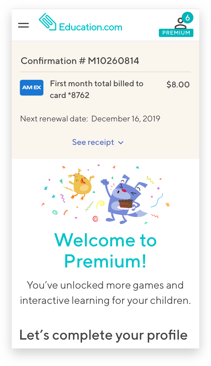
Currently, once users become Premium members we are doing poor job of explaining what exactly they just purchased and how to get started using our learning platform. Right after the purchase, users are seeing a confirmation page which is basically a receipt with a small link at the bottom that either takes them to a generic homepage or to a search results page with our vast resource library being exposed all at once.

Users goals vs. business goals

Key steps in onboarding
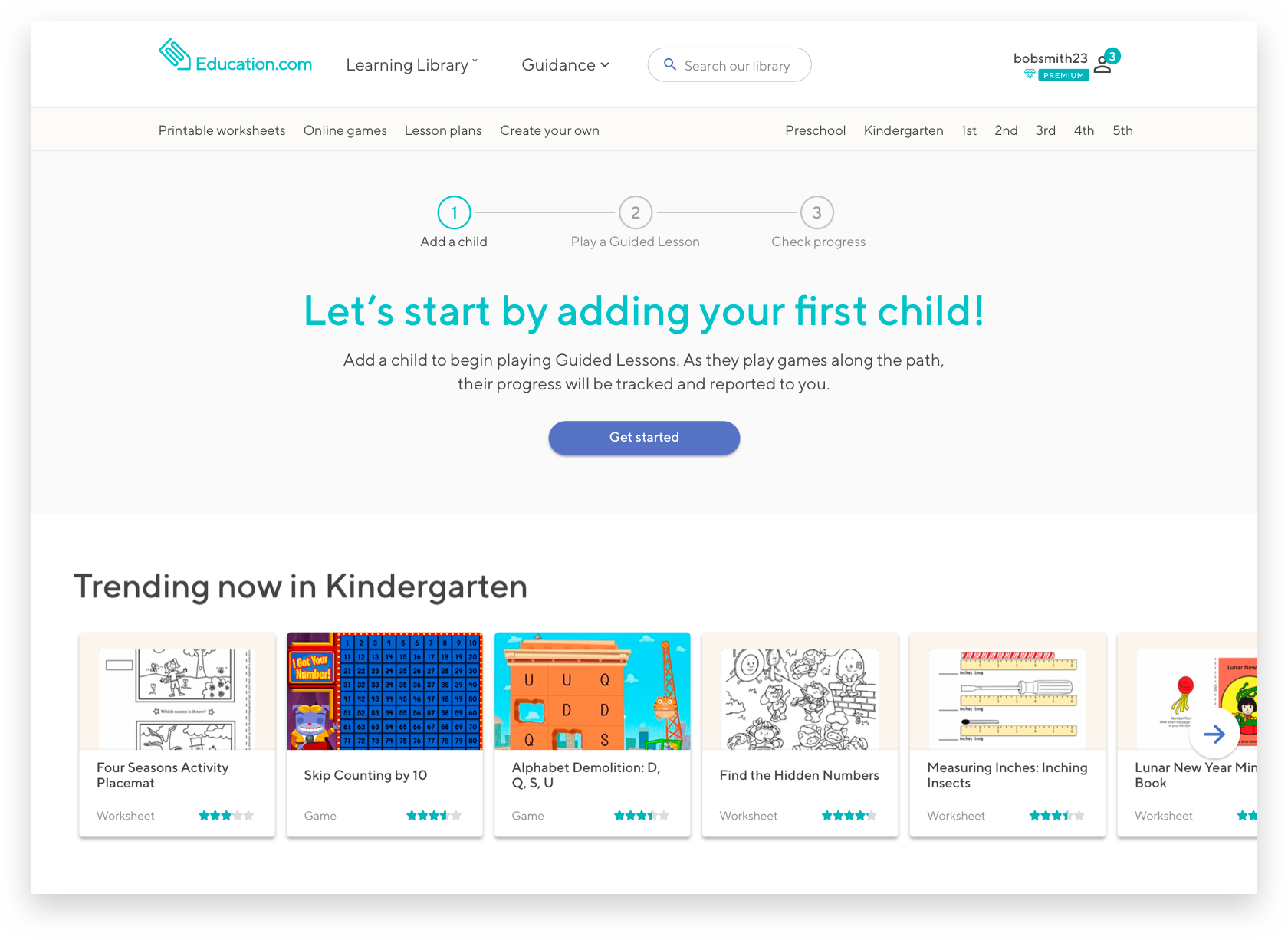
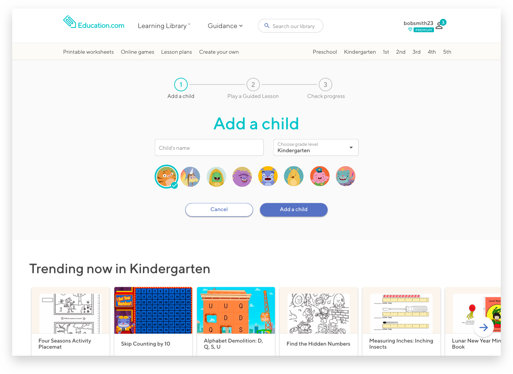
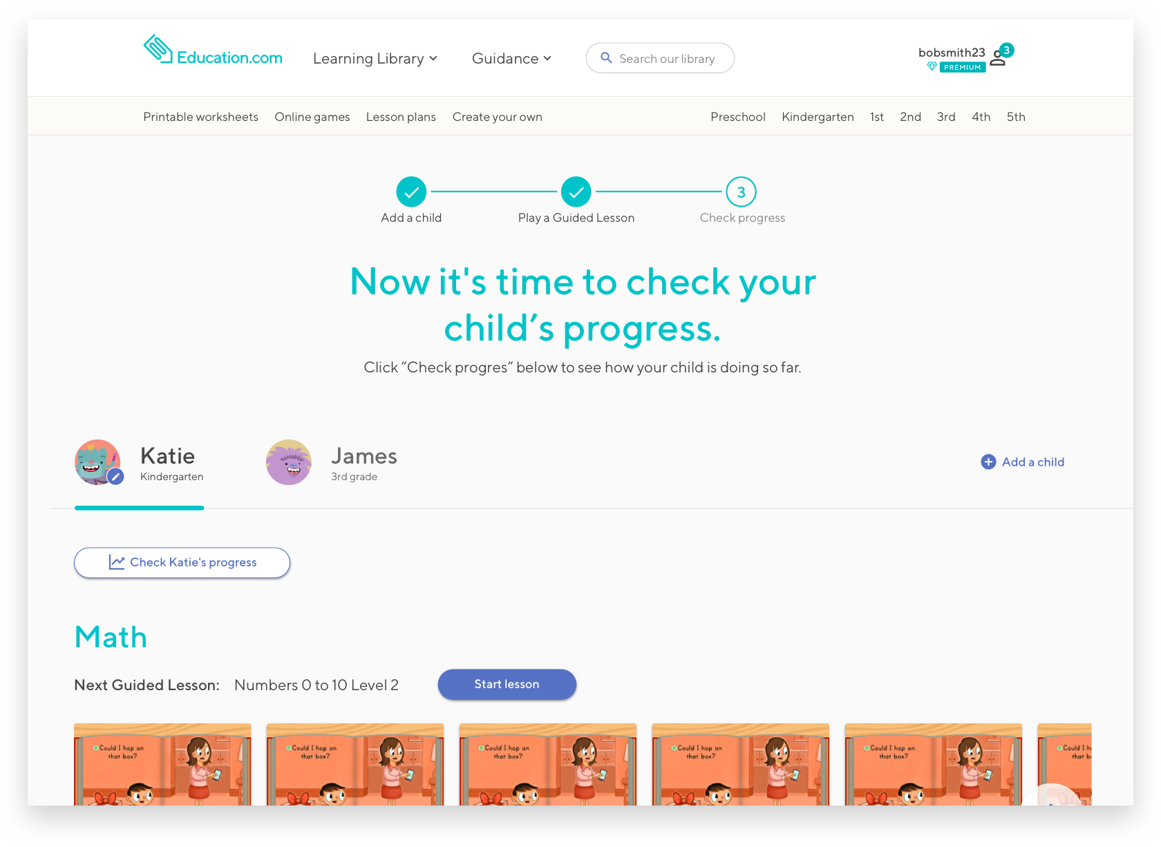
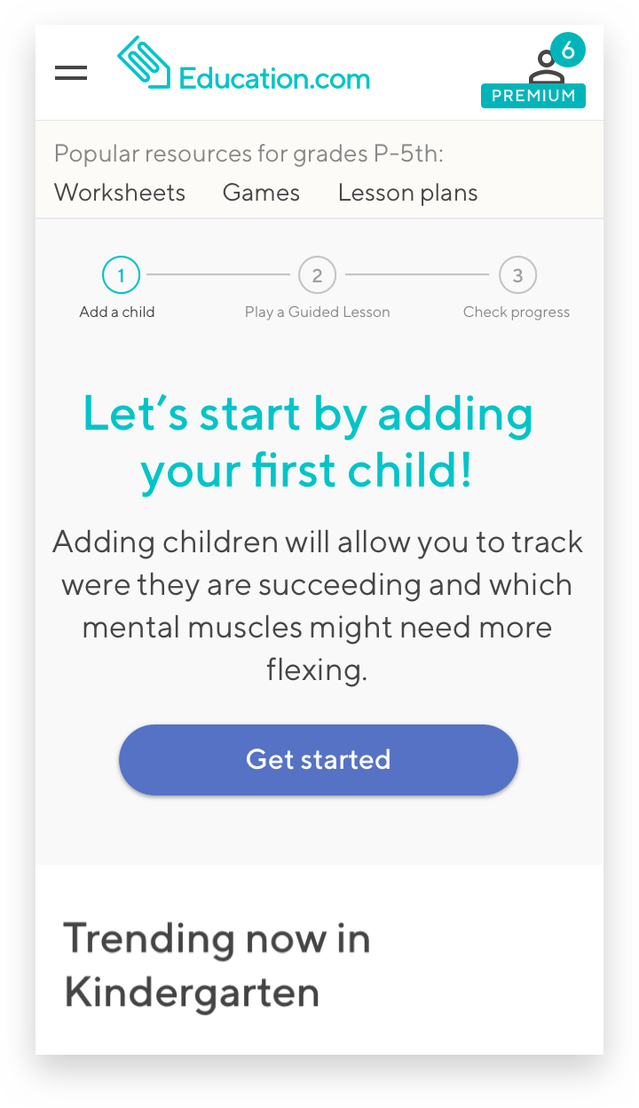
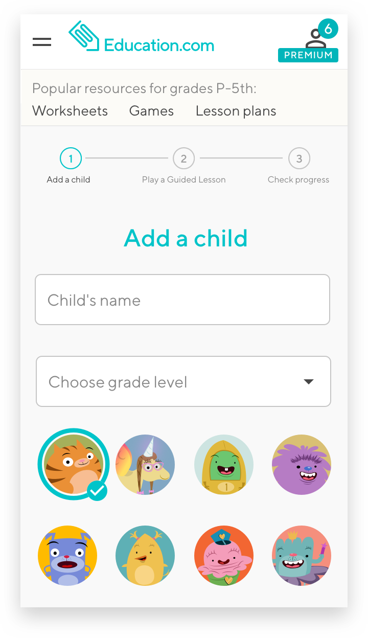
In order to make sure that both our user goals and business goals are aligned, we decided to focus on the following 3 main steps:
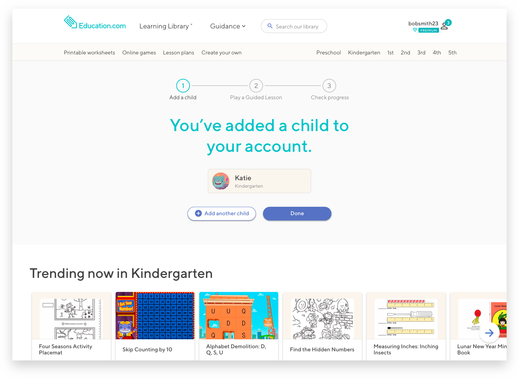
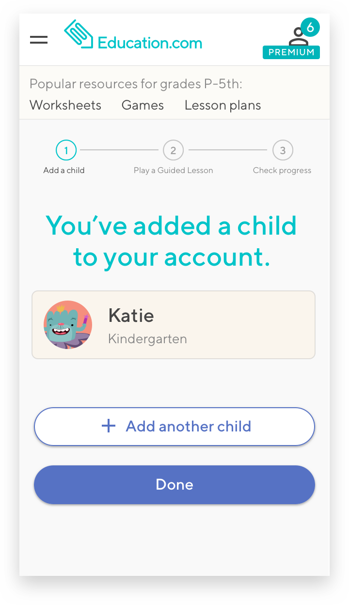
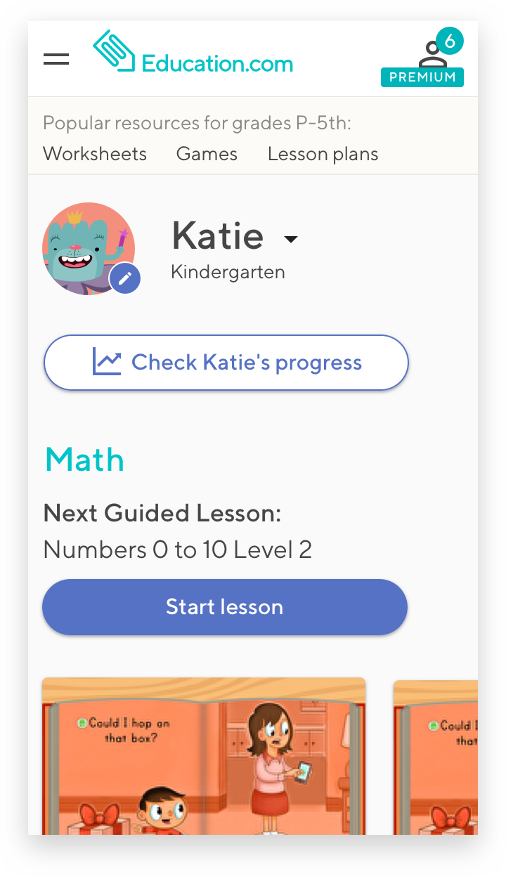
In order for users to start using Education.com to the fullest extent they need to add children to their account
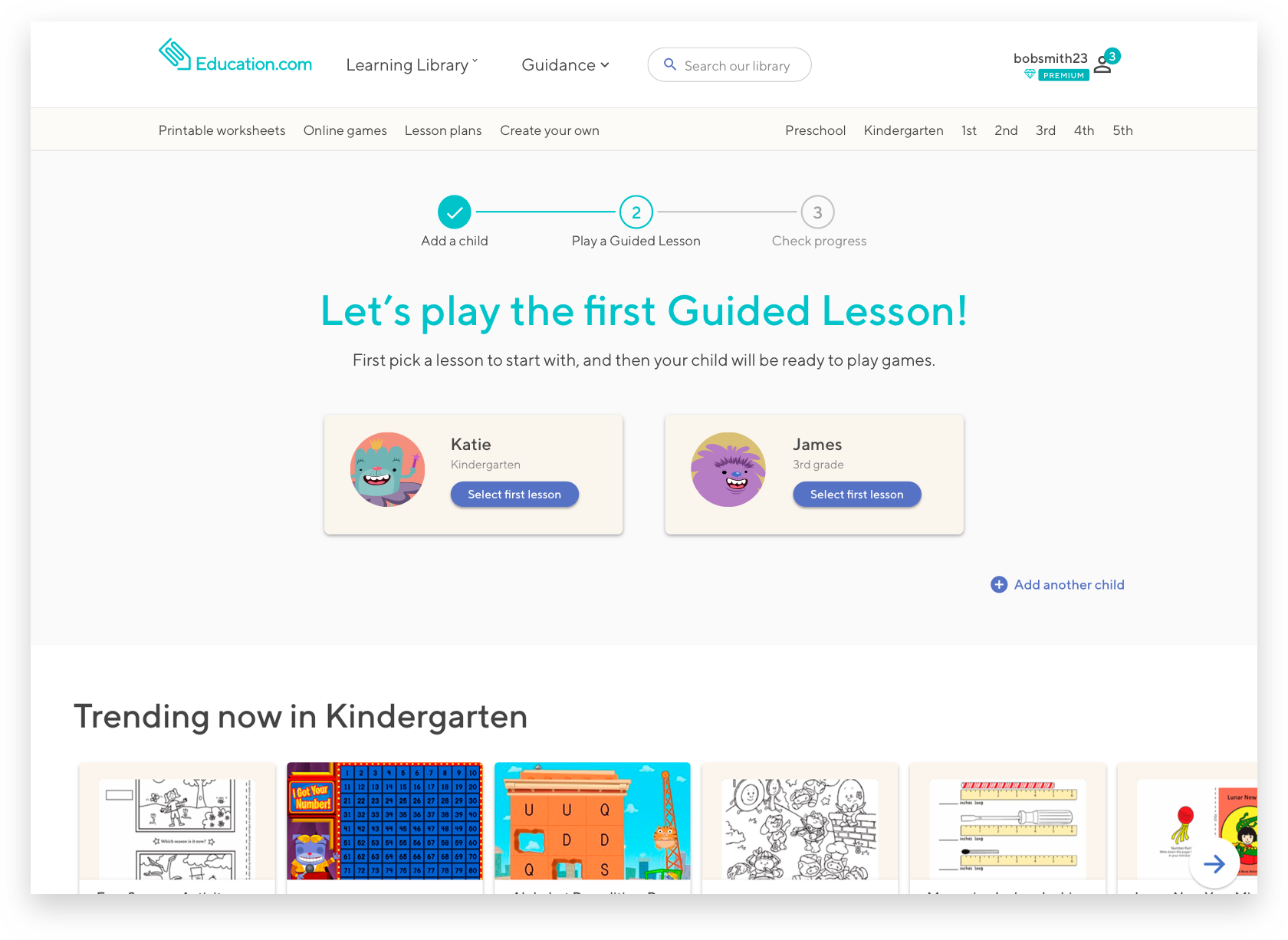
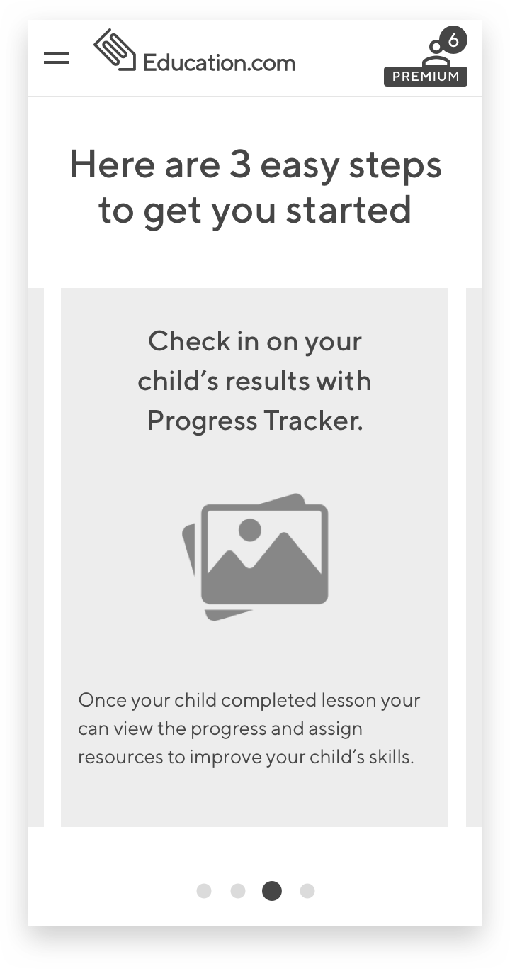
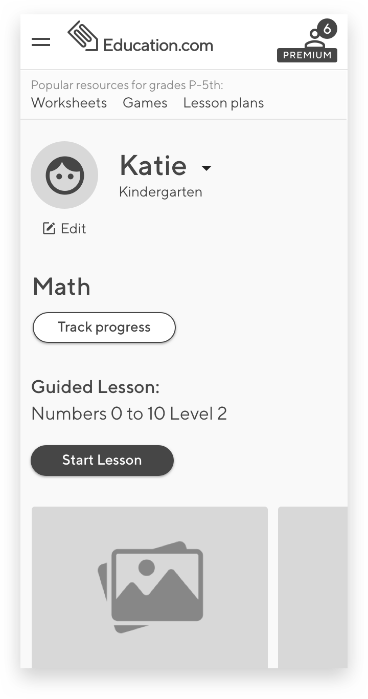
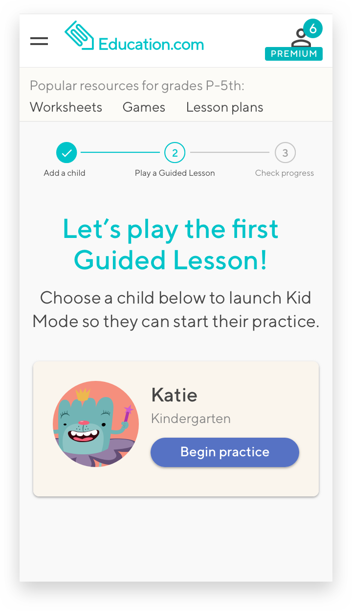
To expose our Premium parents to our learning platform, users need to create an assignment or launch a Guided Lesson for their children
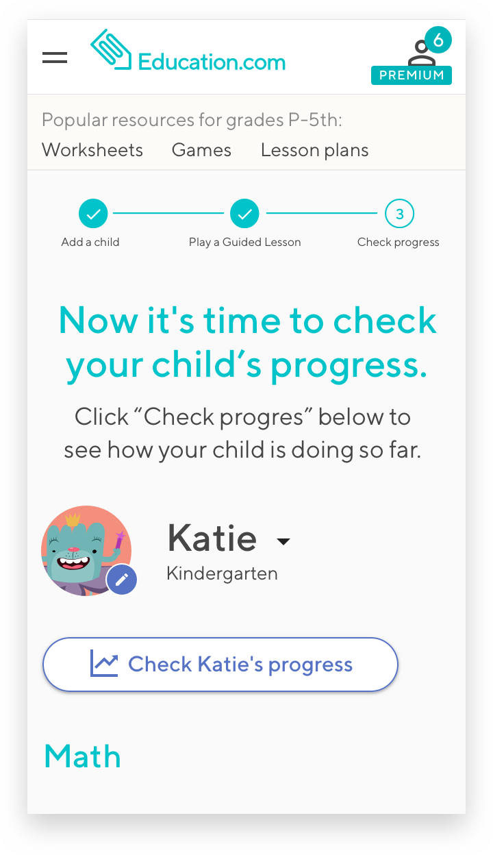
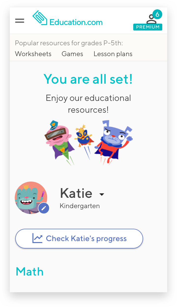
Once a child has completed a Guided Lesson, parent should check on their progress
Things to consider:
Users need to understand why we are asking them to add children to their account.
When does the hand-off to the child happen? What if the child is not next to a parent?
How can we create a seamless user experience and send our users to a different part of our site without creating additional friction points?
02. Key questions
How might we provide our Premium parent with clear guidance on where and how to start using the Education.com Learning Platform
How might we provide our Premium users with clear next steps in their onboarding process
03. Success metrics
Increase user engagement immediately after purchase by ~10%
>50% of users complete the onboarding flow (as opposed to skipping it)
During this state we want to find the answers to the following questions:
Do we have a viable concept?
Does this solve our users’ needs and inefficiencies?
Do our users know what we’re trying to communicate?
04. Iterative designs & Summative research
user flow
Our initial user flow:

Sketches
At Education.com we always start with a mobile-first approach. Once we create a frictionless experience for our user on the smallest screen, designing for other screen sizes will be easier. This approach forces us to think only about essential features and minimize unnecessary noise.

In order to efficiently explore conceptual directions and get quick feedback from project stakeholders, we started with paper, pencil and post-it sketches to get rough ideas out there.
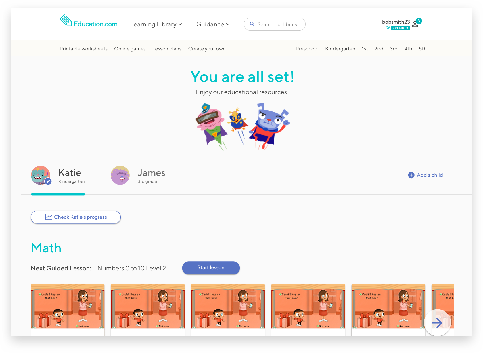
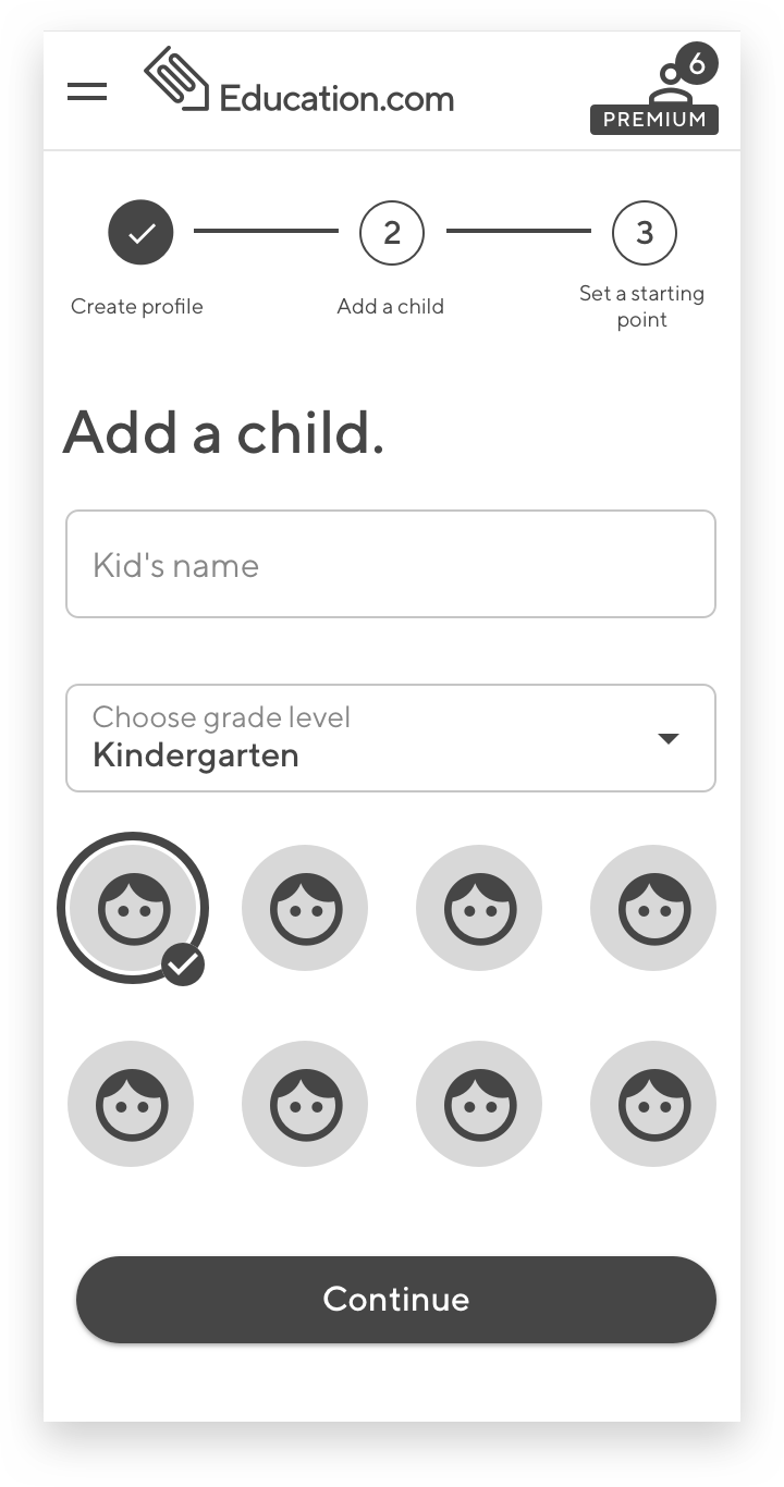
During our meeting with key stakeholders we agreed that for this project we only will be focusing on our users quickly completing the following 3 main steps:
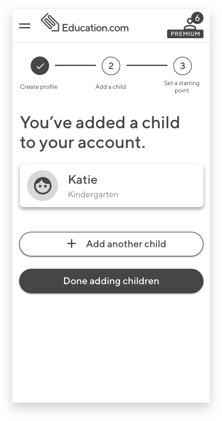
Add a child
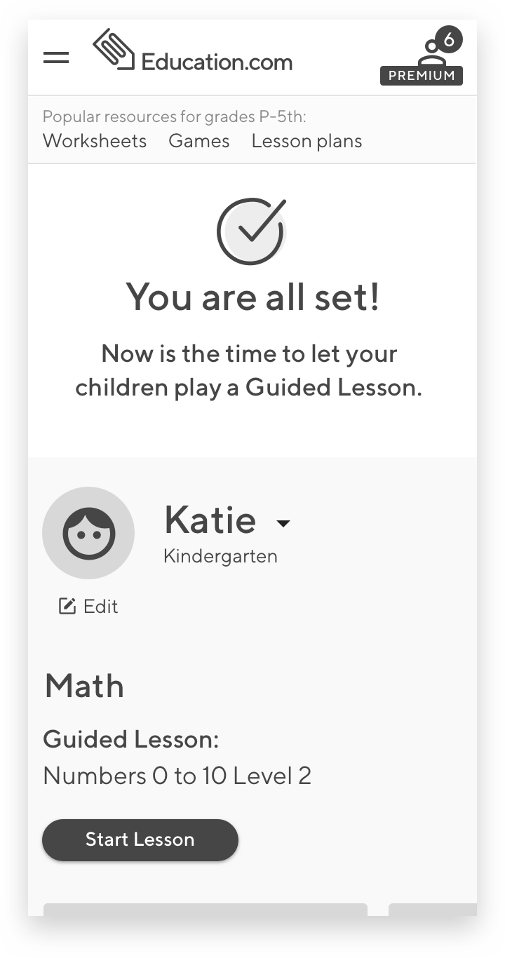
Let child complete a Guided Lesson
Check progress
Wireframes
Now was the time to convert our hand-drawn sketches into wireframes and test them with our users.
Things that we needed to consider:
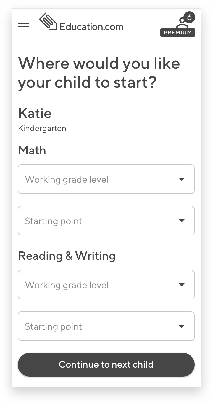
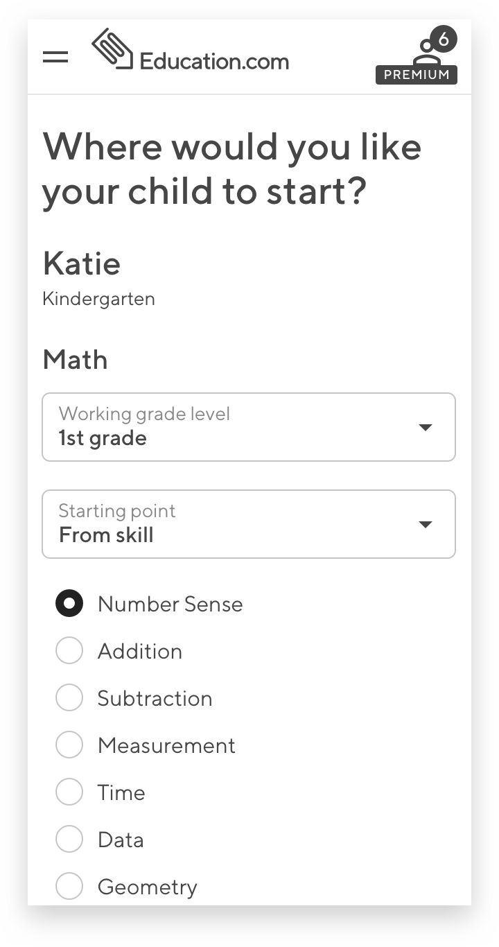
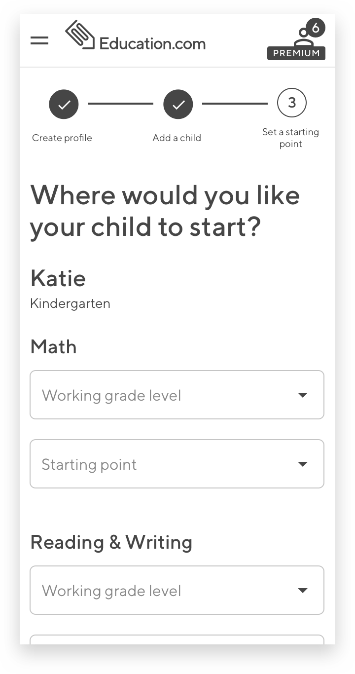
Not every parent will be familiar with their children’s straggling areas, and not every parent will be familiar with the structure of our Guided Lessons, so we need to find an easy and intuitive way of recommending the right starting point for each child
If we were to proceed with this flow, we needed to find a way to set up starting points for all children that were added to the account without asking the user to complete the same task multiple times
User should be able to complete onboarding whether or not the child is next to them at the moment of registration
User should be able to pick up where they left off the onboarding process regardless of what device and screen size they are on
CONCEPT TESTING - DIRECTION 1


CONCEPT TESTING - DIRECTION 2
To validate both of these directions, we tested them with 10 our Premium parent users who recently purchased subscriptions but hadn’t added children to their accounts. The results were the following:
As we suspected with Direction 1, we were asking our users to keep in mind all the steps that they needed to take to onboard before they could act on them. 6 out of 10 couldn’t accurately recall what those steps were. 9 out of 10 found the outline of the steps in the beginning to be unnecessary, as there were not clear calls to action following each step.
Users responded quite well to the idea of having a persistent progress indicator at the top of the page in Direction 2.
In our attempt to find a clear and simple way to identify the starting point for a child on our platform, we created unnecessary confusion. 8 out of 10 users were confused why we are asking them to complete this step during the parents’ onboarding process. Some users suggested that this could be a part of a child’s onboarding when a child starts interacting with our kid-facing product. 9 out of 10 parents wanted to see the list of all guided lessons we offer before being able to confidently pinpoint the starting point for their children.
05 Designing the User Interface
Now that our wireframes were validated, and initial friction points in the user flow were identified and taken into consideration, we were ready to move on to high-fidelity UI designs.
Some general considerations that were taken into account:
We missed a very important step that we wanted our user to complete during their onboarding process - to check the progress of their children
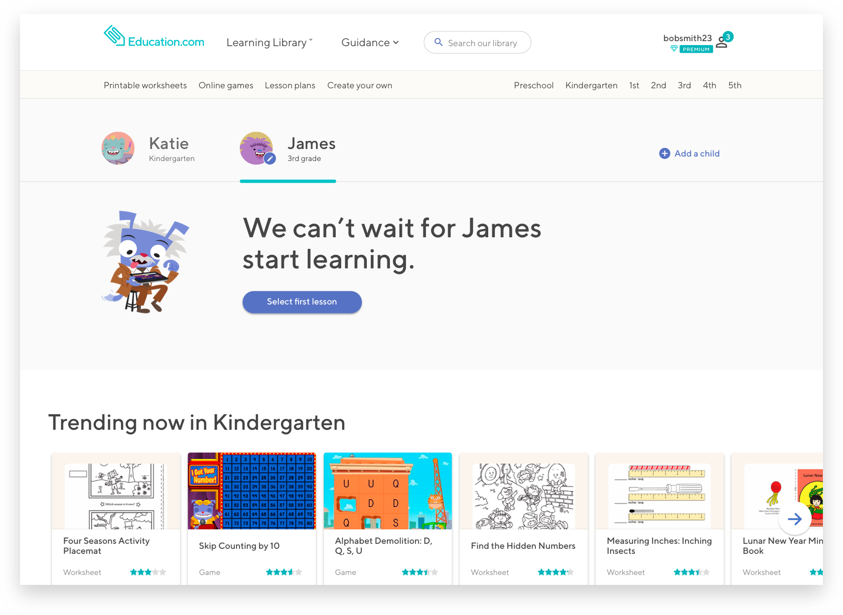
We decided to move away from the idea of asking parents to choose a starting point for their children ahead of time. Instead, once a child was added to an account and was ready to start their practice, the parent would launch the child-facing product where they can choose the desired subject as well as see all the Guided Lesson in the sequential order in the moment and then choose from there.
We also adjusted our initial user flow:

Currently being built
MOBILE
DESKTOP