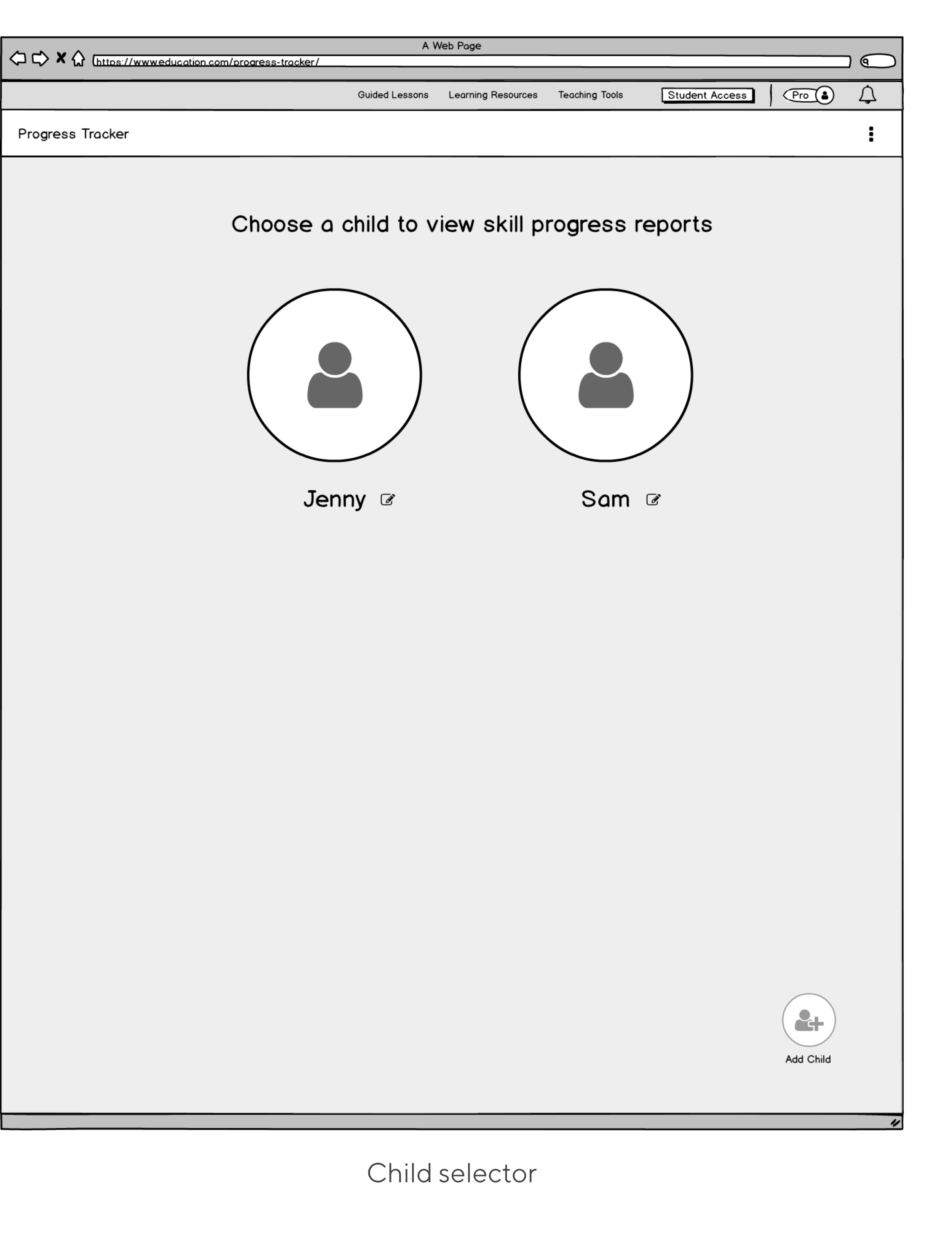
Progress Tracker for parents.

Background
This project started as one massive project that initially tried to create one progress tracking tool that would satisfy needs of two types of users: parents and teachers. However, during our research and discovery phase, it became apparent that both parents and teachers have different needs and goals. We then set out to create a segmented product for our two different audiences.
This case study will be focusing on our Premium parent users.
hypothesis
By creating a meaningful and actionable interface for our Premium parents, we will increase retention rates and number of users adding children to their Education.com accounts.
My role:
UX/UI Designer
My team:
Senior UX Researcher, 4 Engineers, and a Project Manager
The Impact:
Net Promoter Score moved from 25 to 66
System Usability Scale moved from 75 to 84
The percentage of Premium parents adding students to their accounts increased from 26% to 46%
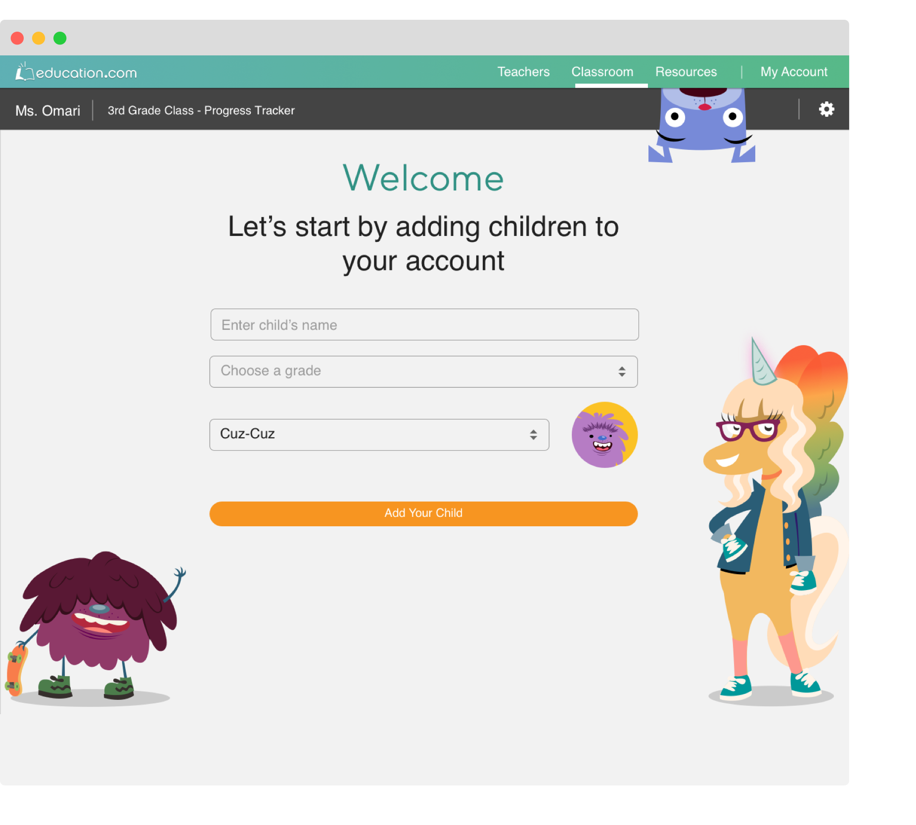
Progress Tracker before redesign
Process
01 Research & discovery
Understand how users use the product now and their mental model of tracking their kids’ progress. Make sense of the data to produce clear next steps.
02 Key questions
What problem are we solving.
03 Success metrics
Identify how we’ll be measuring our success.
04 Iterative designs & Summative research
Making sense of the data to produce clear next steps.
05 Designing the user interface
06 Takeaways and performance
01 Research and Discovery State
As part of the discovery phase of the Progress Tracker we had 1:1 in-depth interviews (averaged 45 minutes) with 7 Premium parents. All interviewees used competitors platforms.
GOALS:
Understand how users use the product now
Understand the mental calculations used to determine academic skill proficiency
Examine the solutions provided by competitors
Determine flow pain points for both the current product and competitor products
Determine usage similarities and differences between parents and teachers
Current user flows
Currently, Premium parents often leave the platform to validate the data shown in the Progress Tracker and manually find resources that are grade level appropriate in order to assign them to their children. This results in constant toggling between different Education.com pages.

Affinity mapping
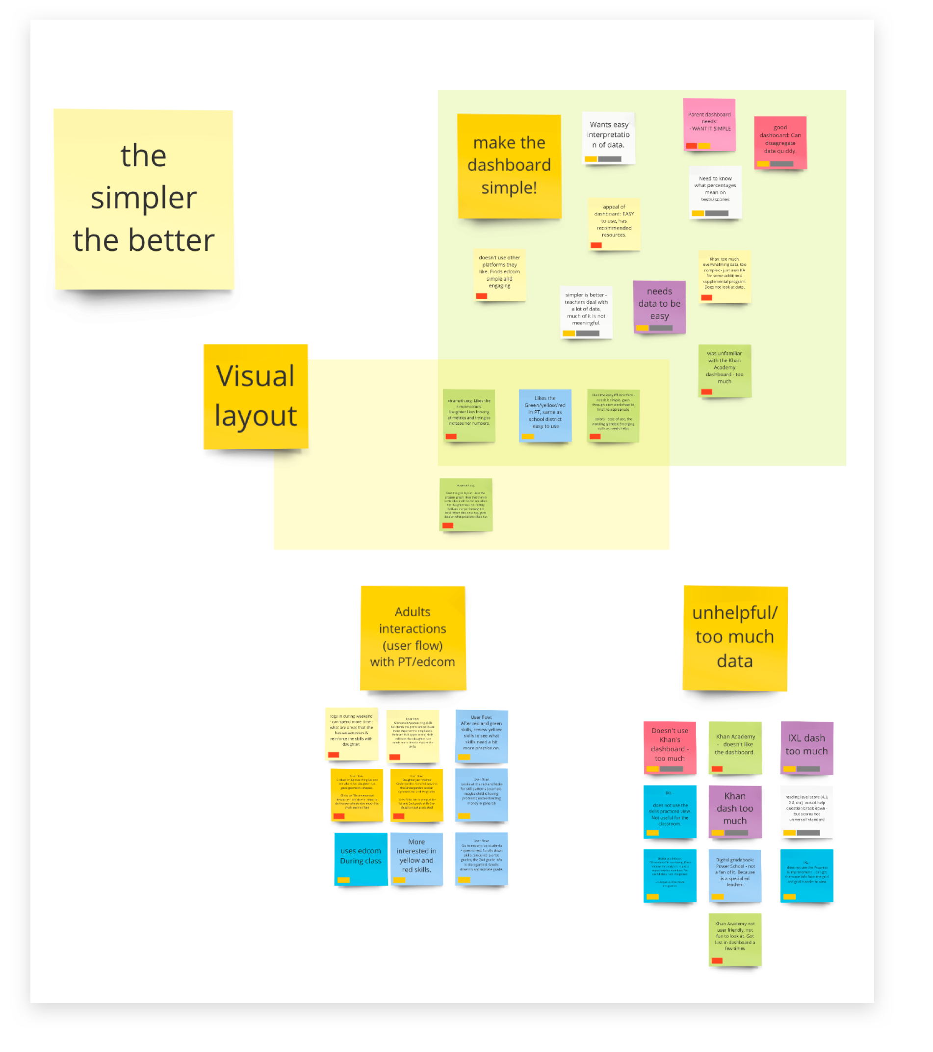
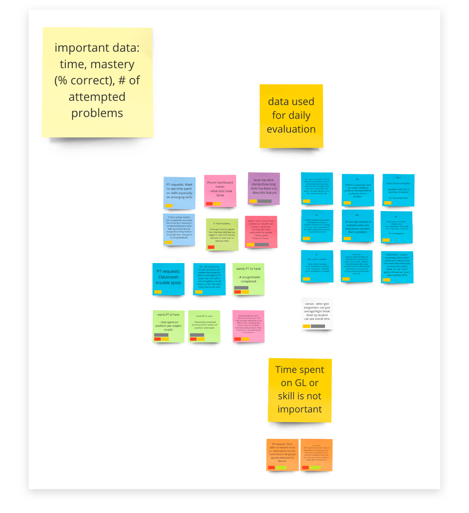
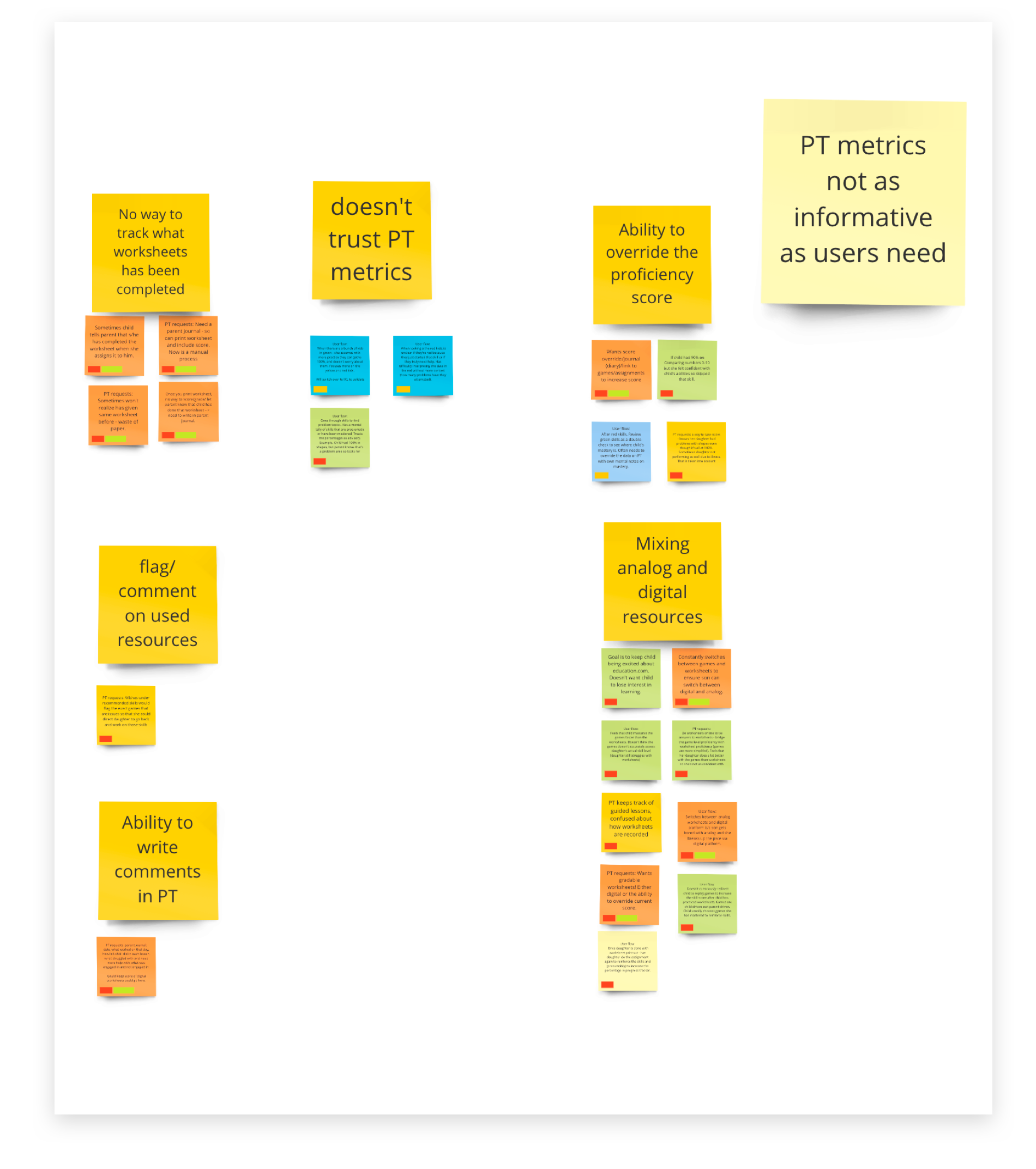
Key findings
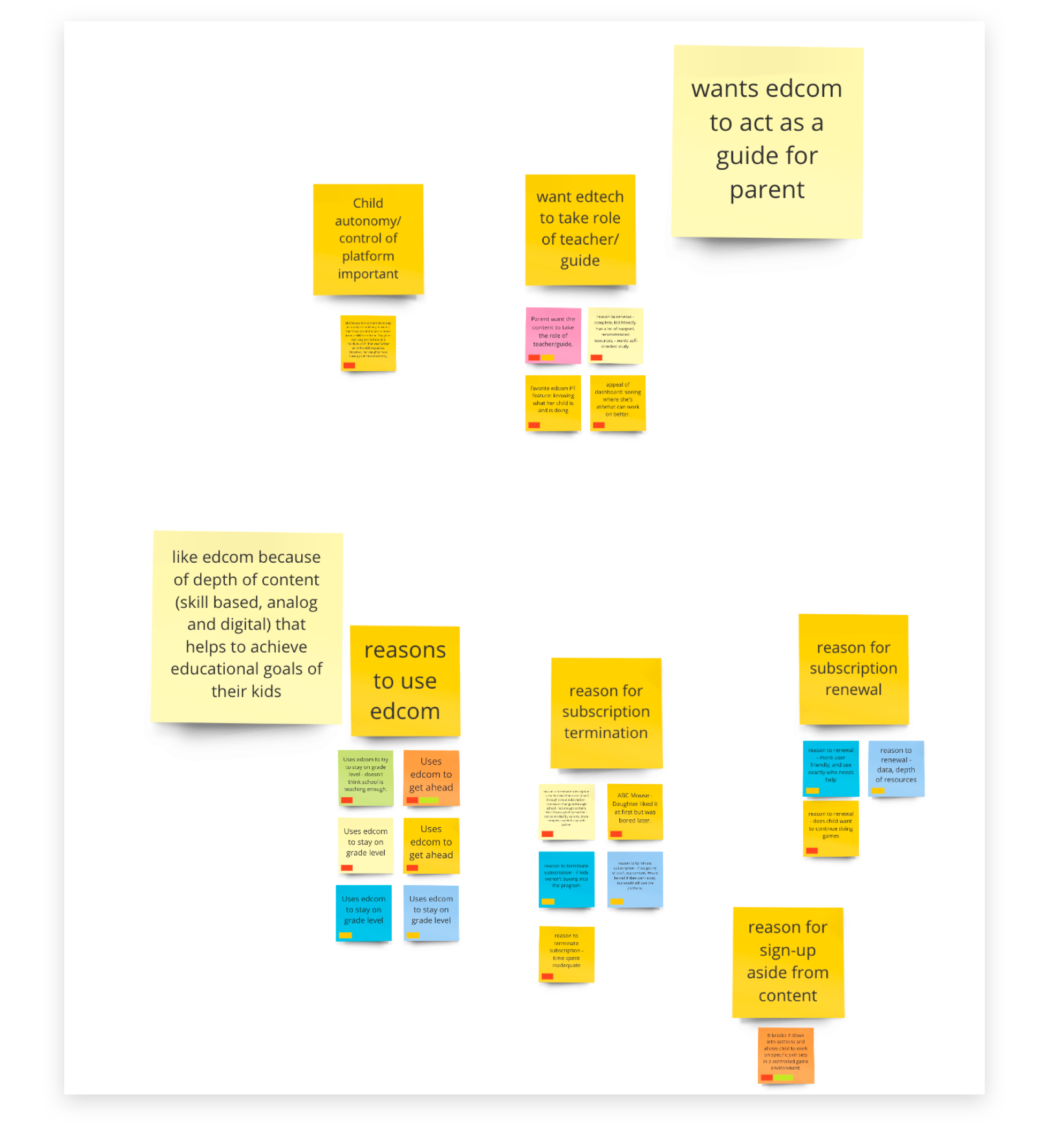
Parents treat Education.com as the primary expert
They want Education.com to be a guide for both the child and parent
Parents also want a quick and simple way to assess how their individual child is doing and what next steps they need to take in order to help their child
Parents are more interested in the individual child’s progress than how they compare to other students
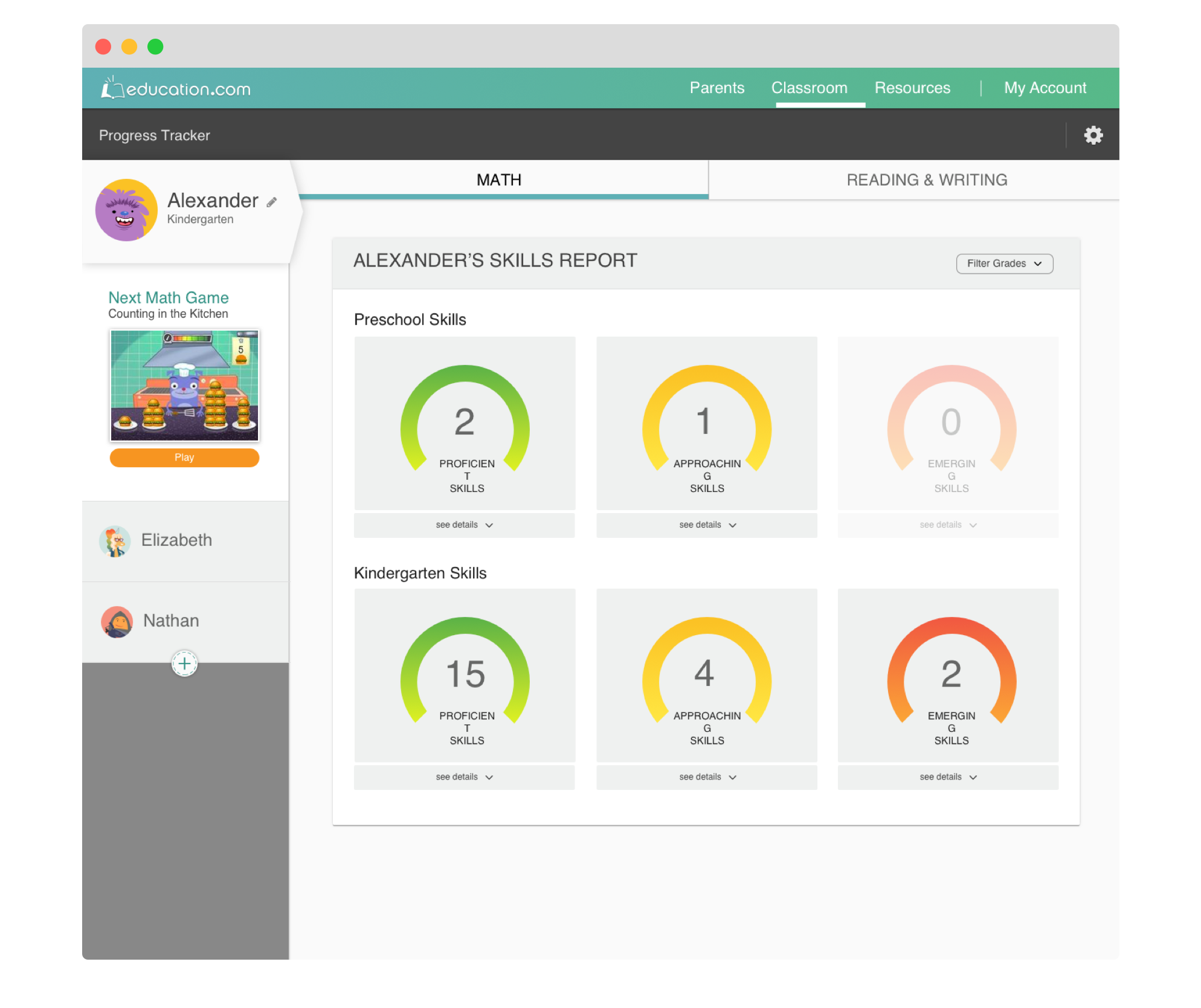
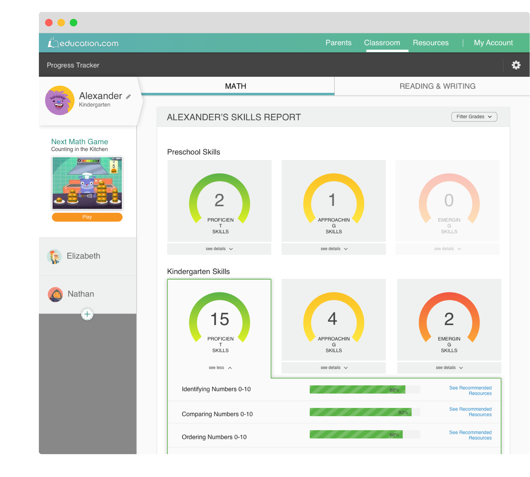
Progress Tracker metrics are not as informative as users need
Parents mostly use Education.com’s Progress Tracker as a way to see areas of concern at the individual problem level
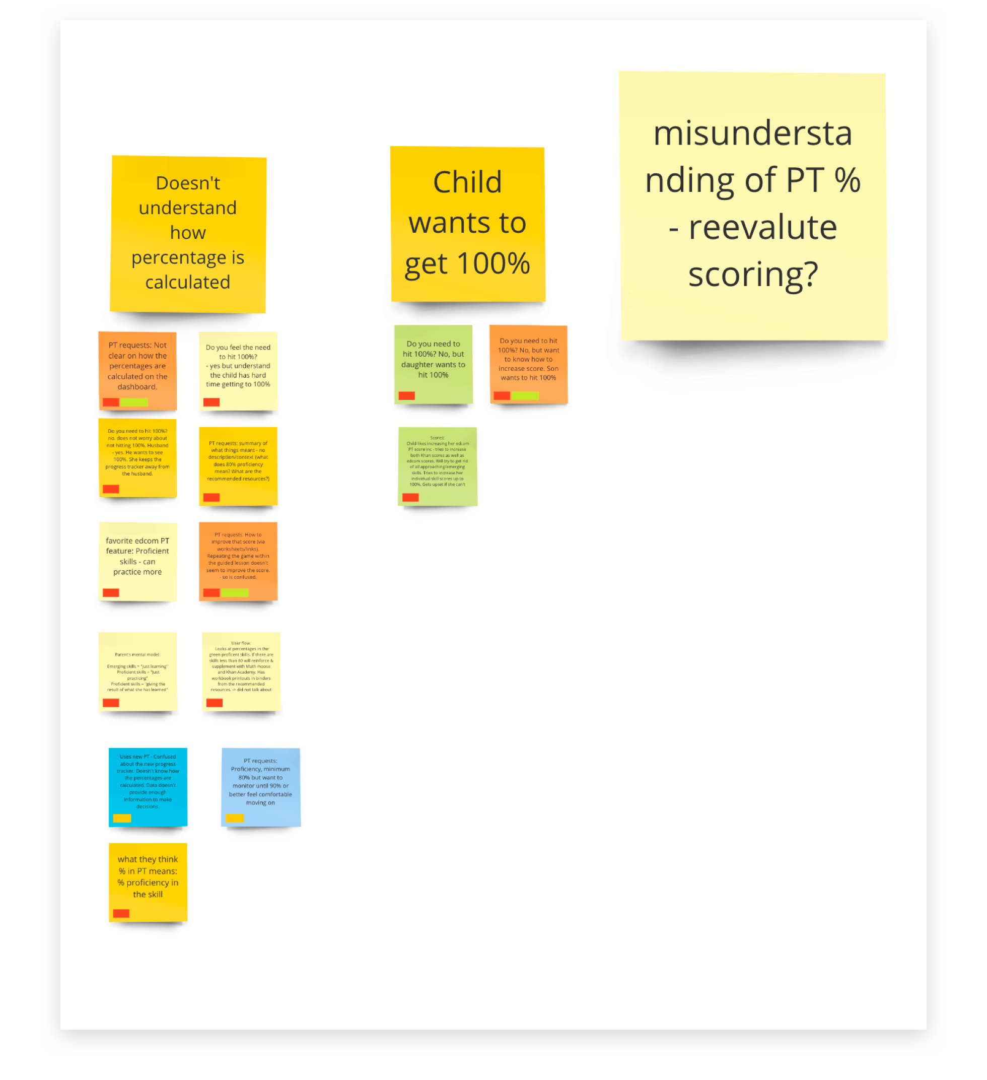
Parents want to have the ability to incorporate worksheet scores into the progress tracker score or overwrite score proficiency
Parents requested the ability to annotate/comment on individual skills
Parents need to have a clear path to how their child can achieve 100% mastery (not just proficiency)
Ideal User flows
Based on the research findings we identified our Premium parents user flow prior to their child’s interactions with Education.com platform:

02. Key questions
How might we provide our Premium parent users with help to identify problem areas for their children and quickly assign them the resources in order to improve their skill proficiency?
How might we increase the usage of this tool
03. Success metrics
Once the scope was identified, it was time to think about success metrics against which our new design will be measured:
The percentage of users opting-in to the new Progress Tracker
Percentage of users assigning and reassigning recommended resources to their children
During this state we want to find the answers to the following questions:
Do we have a viable concept?
Does this solve our users’ needs and inefficiencies?
Do our users know what we’re trying to communicate?
04. Iterative designs & Summative research
Sketches
We brainstormed as a group and narrowed down our directions to three concepts, which were presented to both our developers and main stakeholders for directional feedback.

Wireframes
Once our initial ideas were reviewed by internal stakeholders and we identified directions we wanted to proceed further. We converted our hand-drawn sketched into wireframes and tested them with our users.
CONCEPT TESTING - ROUND 1
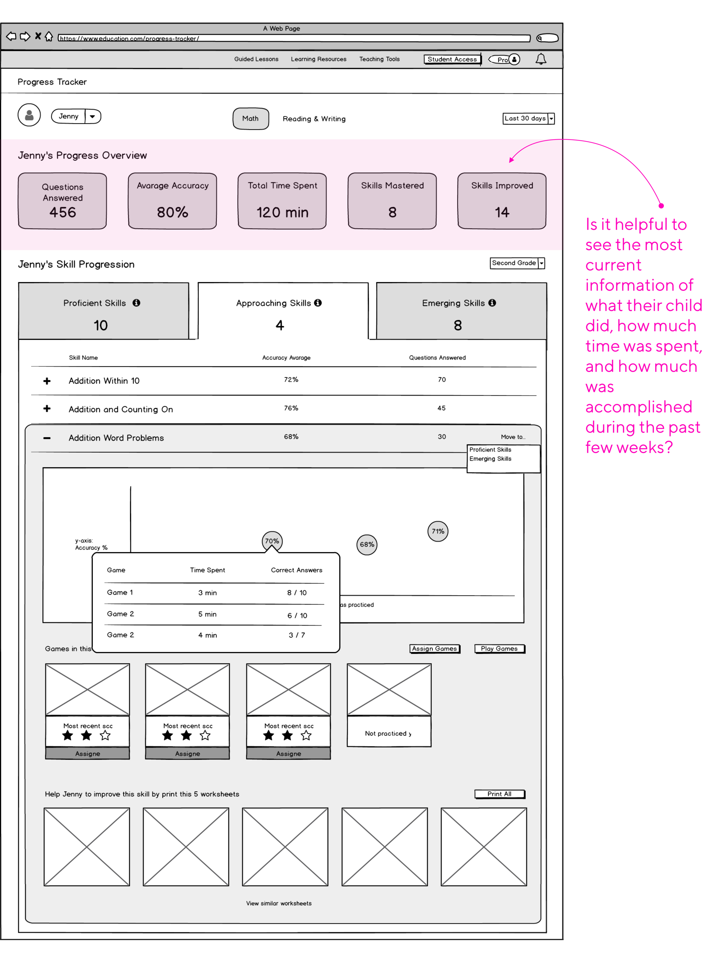
The findings:
Subject switcher as well as grade selector was hard to notice.
The information that just stated time spent on the platform, skills that need attention, and skills improved without additional actionable data was deemed confusing and unnecessary.
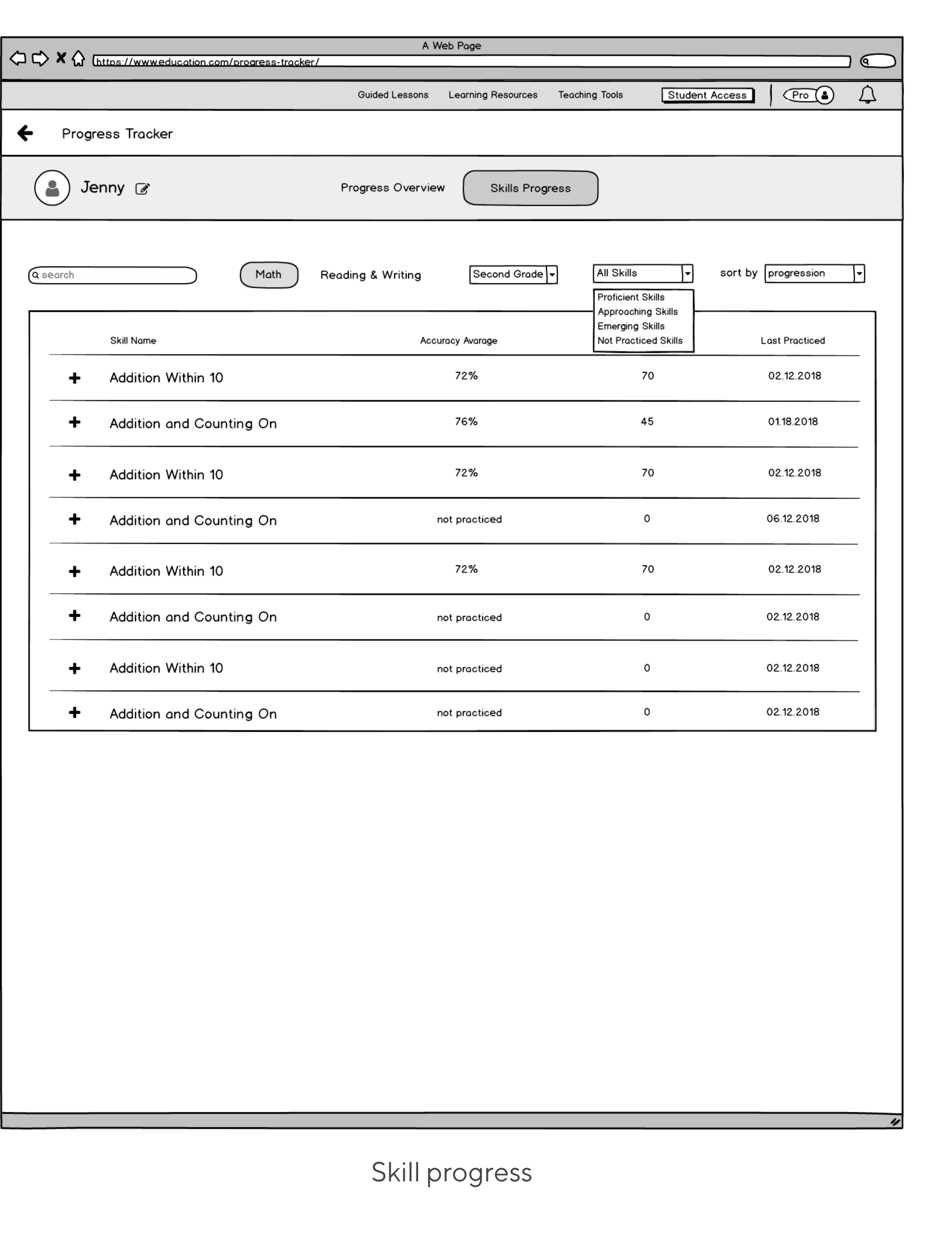
1 out of 7 parents thought that seeing skills grouped by proficiency levels would potentially be useful to her. 6 out of 7 preferred skills being grouped by domains such as addition, subtraction, etc.
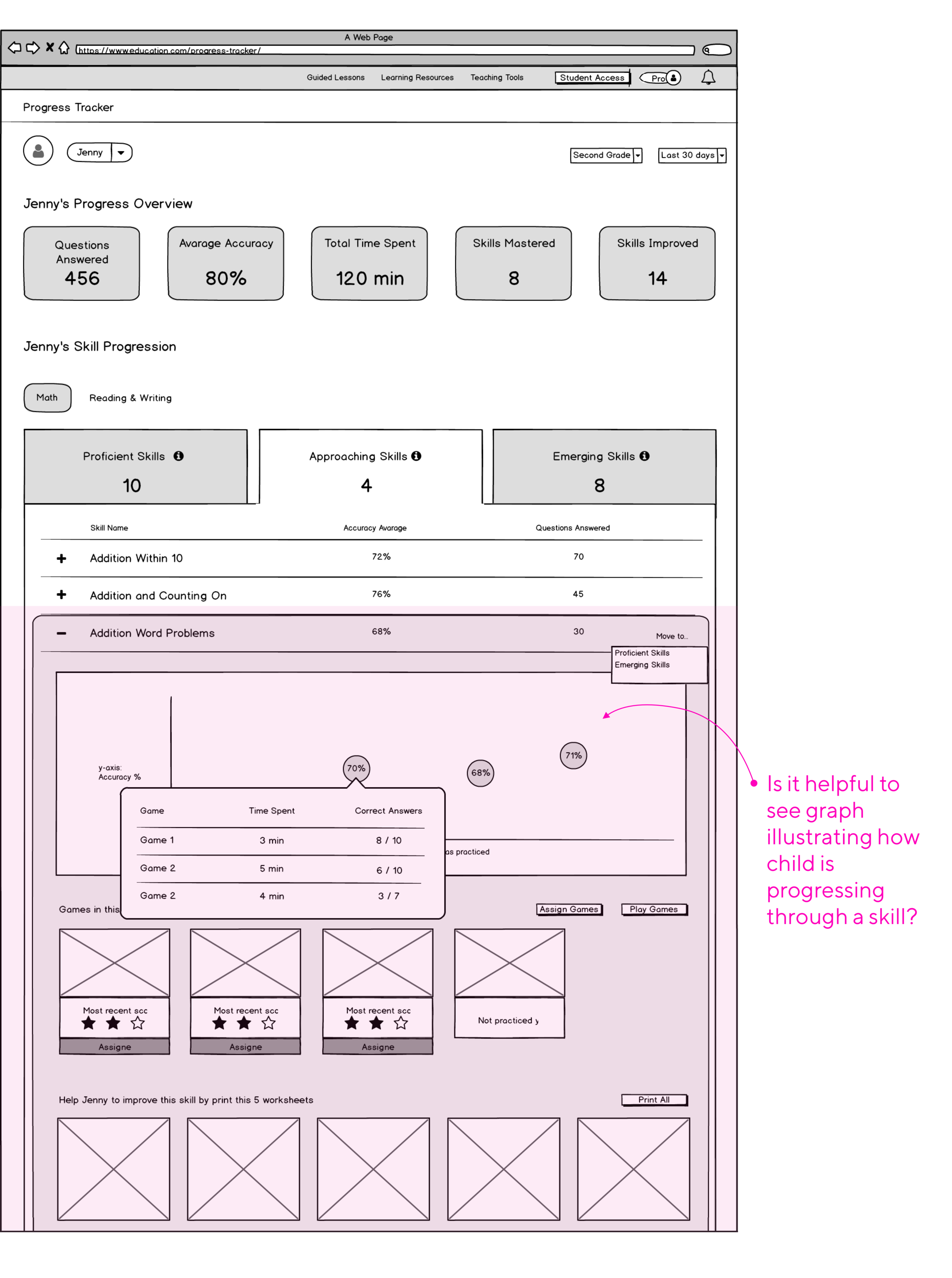
4 out of 7 parents found the idea of seeing a graph of how their child is progressing through a skill to be quite interesting in order to assess whether their child is progressing or regressing over time.
On a student detail page, parents were expecting to find all the activities that a child did for that skill as well as what questions were answered incorrectly. Just like teachers, parents wanted to see time on a activity and number of attempts to solve it in order to assess whether a child was guessing answers or if they truly don’t understand that concept
What we wanted to know:
If providing parents with the most current information of what their child did, how much time was spent, and how much was accomplished for the past few weeks would help them see the value of using Education.com platform on a regular basis?
By grouping skills into proficiency level buckets, would it make the parents’ task of assessing how their child is doing easier?
Is it helpful to see a graph illustrating how a child is progressing through a skill?
What information was expected to be found once skill was expanded?
CONCEPT TESTING - ROUND 2
What we wanted to know:
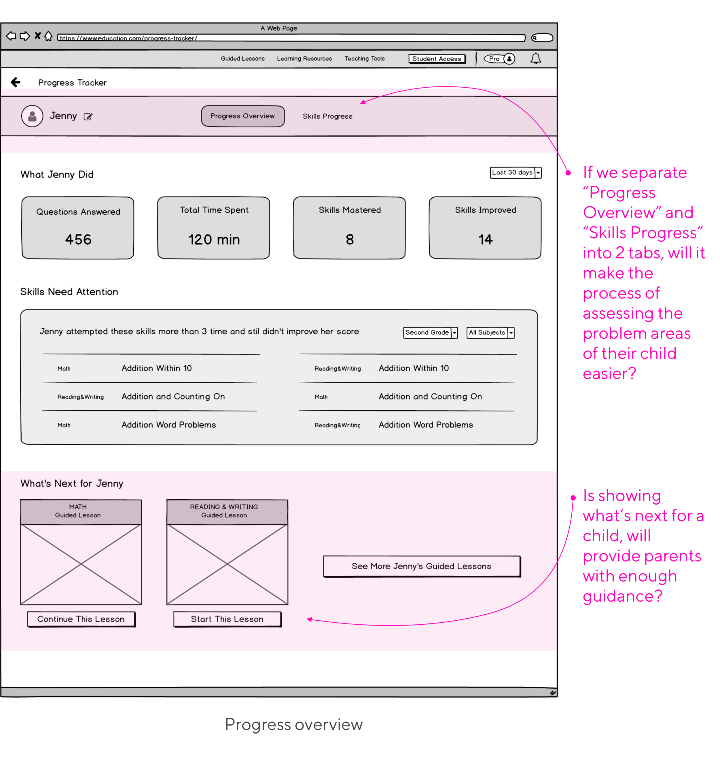
If we separate “Progress Overview” and “Skills Progress” into 2 tabs, will it make the process of assessing the problem areas of their child easier?
By showing on “Progress Overview” tab what’s next for a child, will it provide parents with enough guidance for what their child should be doing next?
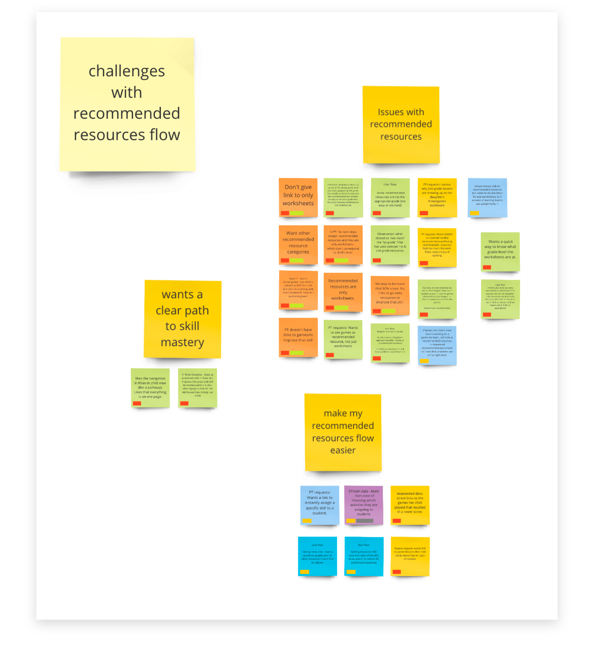
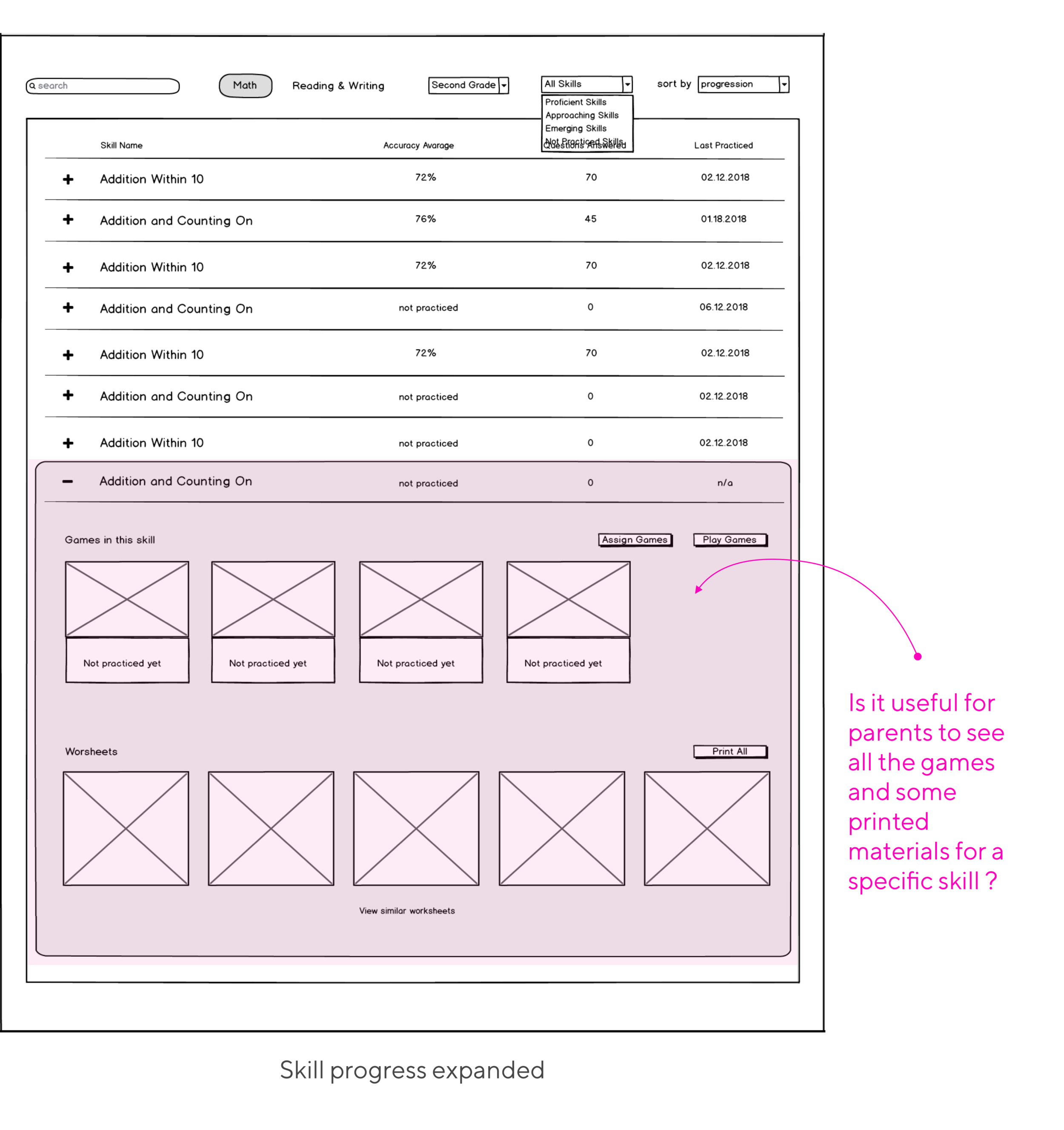
Is it useful for parents to see all the games and some printed materials for a specific skill inside of “Skill Progression” tab? How would they use this information?
The findings:
4 out4 out of 7 parents were confused whether they are seeing overview of the progress for both subjects or just for one.
For 5 out 7 users data shown in “Progress Overview” has to be actionable, otherwise they most likely will ignore it.
6 out 7 parents liked the idea of seeing what’s the next step for their child, but thought this was the wrong place to show it.
Seeing what games are inside of each skill and what games have been played and what have not, was quite helpful for some parents as they can understand what contributed to the proficiency score for that skill.
7 out of 7 absolutely liked the idea of being able to assign or reassign games of a specific skill.
CONCEPT TESTING - ROUND 3
What we wanted to know:
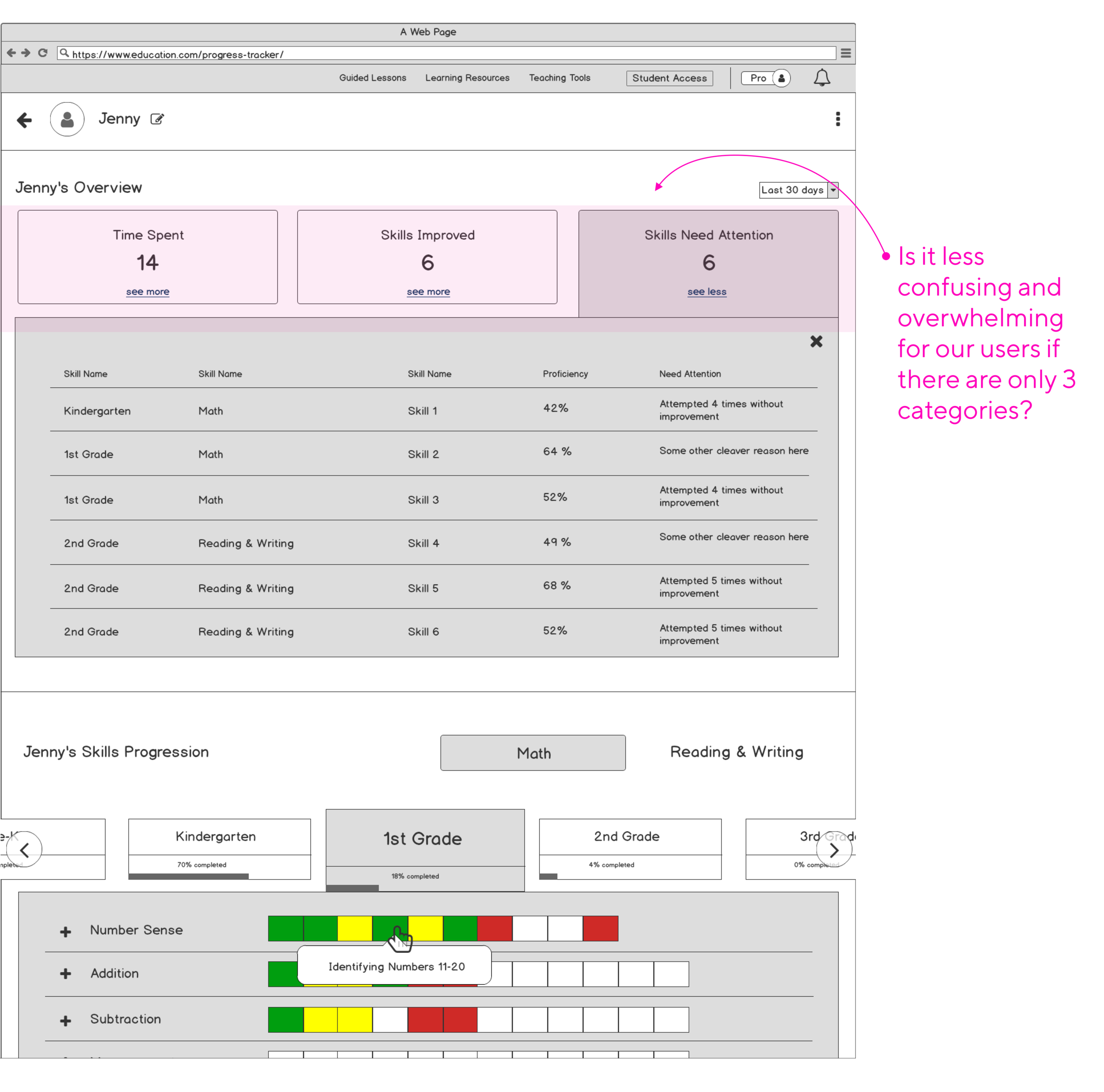
Would it be less confusing and overwhelming for our users if there are only 3 categories displayed on a child’s overview section: time spent, skills improved and skills need attention?
How easy is it for users to find the subject switcher?
Is it useful for parents to see all the grades shown, even though their child is likely just working on one grade level?
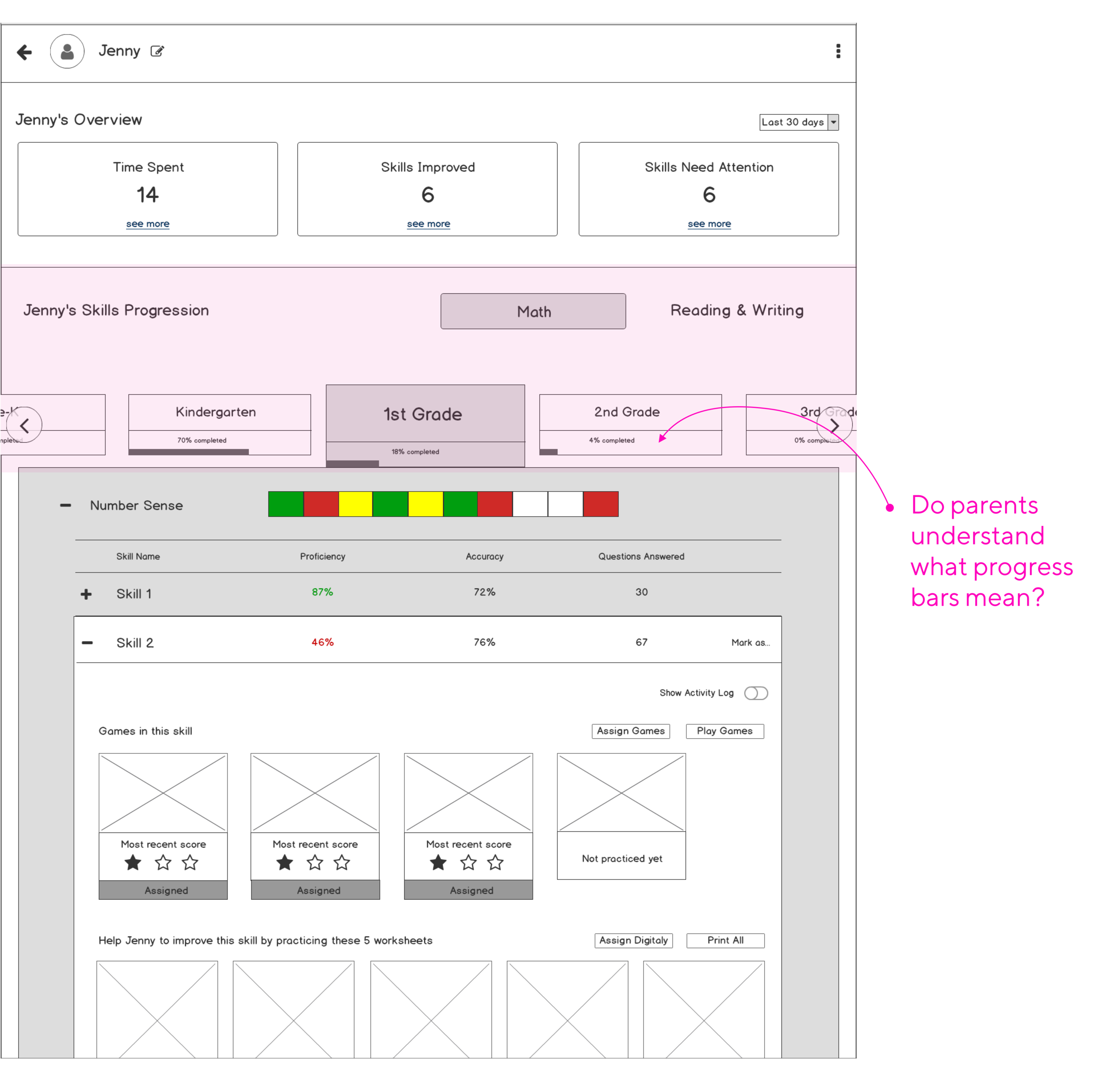
Do parents understand what progress bars inside of a grade tab mean?
The findings:
Parents find the section with “Skills Need Attention” to be the only useful information out of all three (“Time Spent” and “Skills Improved” were considered unnecessary)
Parents also would like to see a different representation of progression through each skill domain. They found squares to be confusing and uninformative although they didn’t have difficulty understanding color coding. Red meant something bad, green is good, and yellow requires more work. But they had a hard time understanding what exactly those squares represented
4 out of 7 parents thought that the subject switcher was still hard to notice.
7 out of 7 parents understood that progress bars inside of grade tabs represented percentage of skills completed for a grade.
05 Designing the User Interface
Now that our wireframes were validated, and initial friction points in the user flow were identified and fixed, we were ready to move on to high-fidelity UI designs.
Iterations
FIRST ITERATION
Some rationale behind our decisions:
Based on the feedback from our Premium parents, we needed to rethink placement and what information to show to parents for their child’s remedial skills
Some of the parents didn’t find it useful when all 7 grade levels are visible. Therefore, we experimented with the position of the grade level tabs so that parents could change the grade if they needed to, but the position wasn’t as prominent or confusing

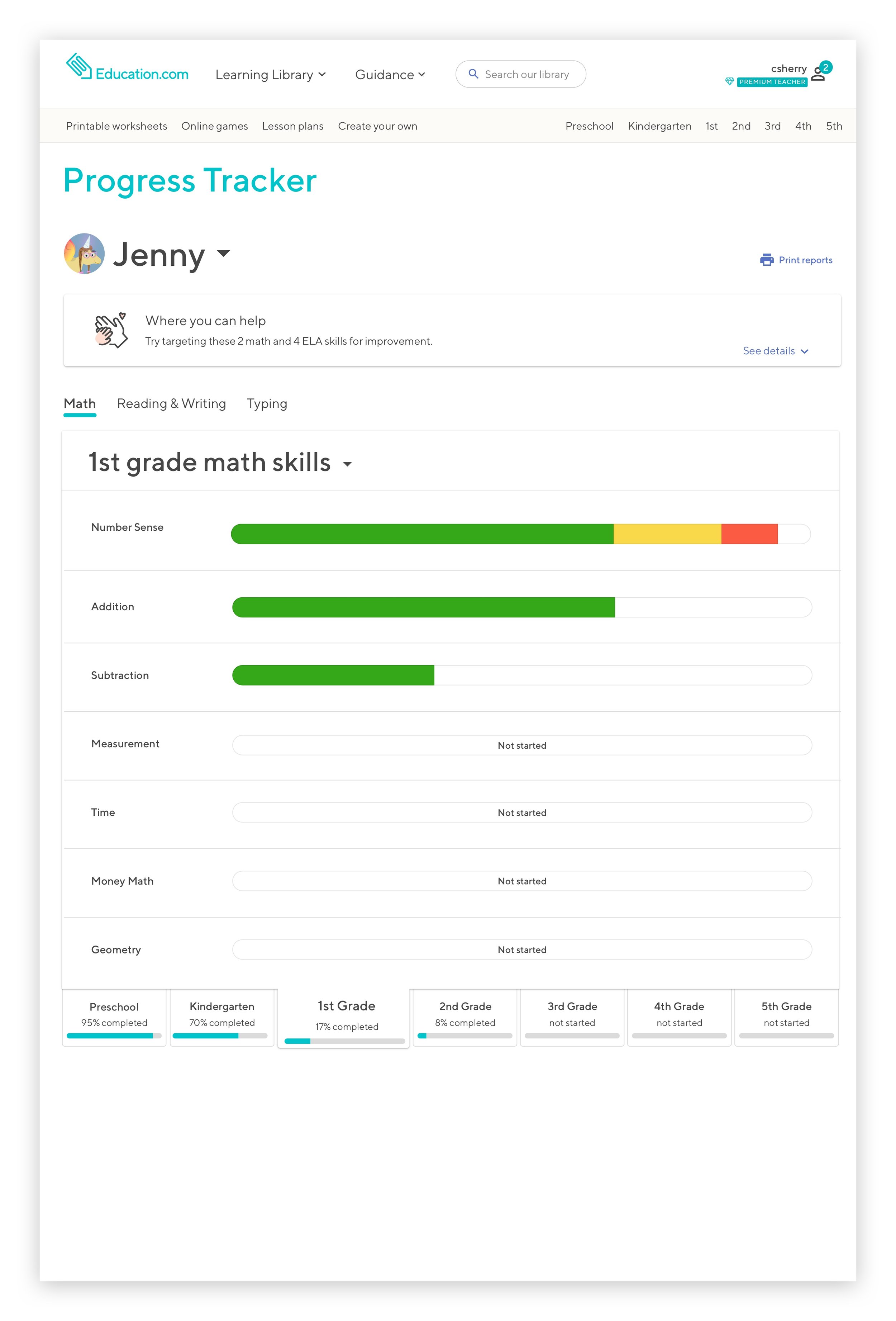
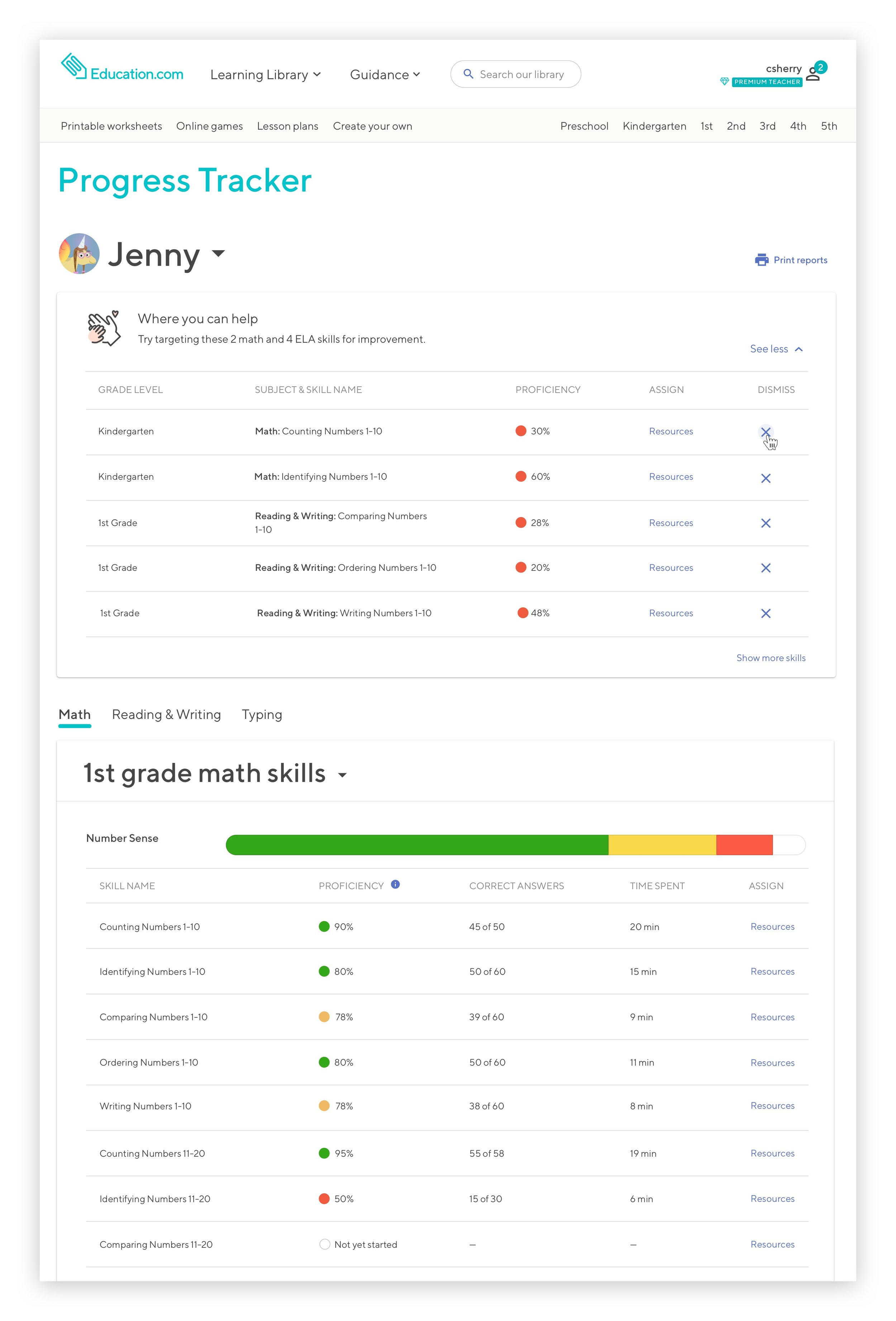
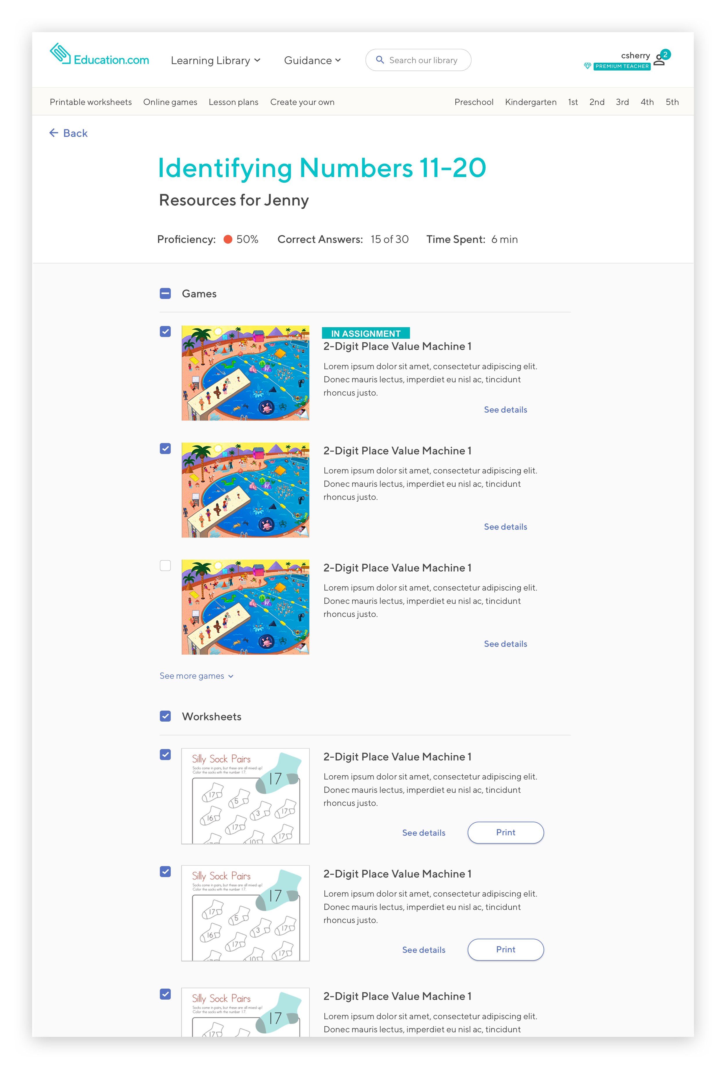
FINAL DESIGNS
Some rationale behind our decisions:
Some rationale behind our decisions:
We wanted the task of addressing remedial skills to be very easy and intuitive
The final designs we came up for assessing the progress of individual child has to work for both parents and teachers, in case teachers want to drill down into an individual student’s progress
Seeing circles as a representation of the mastery level of the skills inside a domain was found to be overwhelming and confusing. This was especially true for the case when a skill domain had more than 10 sub-skills. As a team we decided to go back to the original idea of showing the progression of a child through the skill domain in the shape of the progress bar
Some parents also mentioned that they would like have the ability to dismiss skills that are marked as remedial on our platform where in the fact the parents know that their child is proficient in this skill
06 Takeaways and Performance
Takeaways
Design products to guide novice users to function like experts
Novice users crave guidance. The higher level they can function without being an expert, the more delighted they will be
Performance
The percentage of Premium parents adding students to their accounts increased from 26% to 60%.
Testimonials
“I really really like the new how can you help section. I can zoom right in on how to help her, assign the games and help her with the worksheets I print out.”
-he…et@gmail.com
“I absolutely love the idea that I can come to see how my daughter is getting on and download worksheets to help her progress. This is such a wonderful tool.”
-mu…ht@gmail.com